Linkedin - 700 middlefield
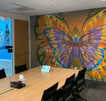
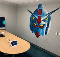
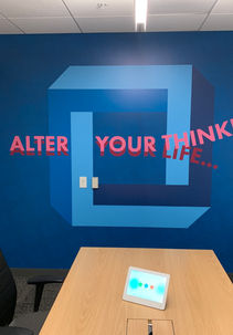
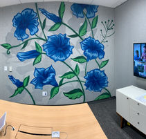
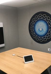
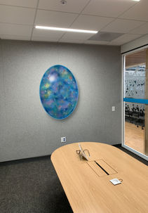
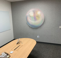
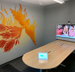
The gallery below is a selection from over 260 unique art & graphic features in conference rooms at LinkedIn's campus in Mountain View, California. SWEAGA was given the task of creating all of these features to help inspire and entertain the employees who meet in these rooms. Our team, along with a handful of artists, designers, installers and crafts people created this vast amount of art.
These art features were installed throughout three buildings. Each building has a theme which relates to LinkedIn's culture and values; Transformation (Change Is Good), Integrity (Be A Legend), and Collaboration (It's a Small World). All the art we created was intended to show the qualities and meaning of those themes.
ace hardware - reno, nevada
This mural on Ace Hardware in Reno, Nevada is an original design, hand-painted by Joe Fenton. If you know the history around the gold rush, you know that the hardware stores were an even bigger boom than the gold fields themselves. So this meditative miner speaks to the legacy of hard work and success. We also painted a nice big logo on the building.


a16z - San Francisco
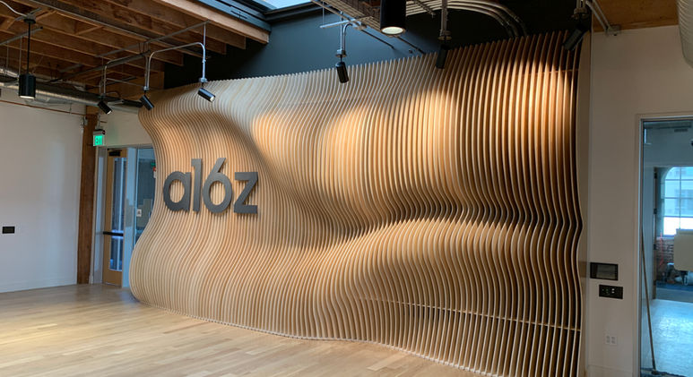
This was a very unique project for us. We were given a concept sketch and asked to create a parametric wall as a center piece for Andreessen Horowitz new office in San Francisco. We partnered with the Idea Fab Lab, Santa Cruz to help us with fabrication and installation.
Denali therapeutics - South sf
We worked with the Internal Communications team at Denali to create this interactive mural which will feature patient photos and stories. Each point on the path is magnetic and will have a "trail marker", which is a small pin board that will be attached to it. Patients will have an opportunity to pin their photos and thoughts for Denali staff to see the impact they're having by developing treatments.


LinkedIn - Gsoc office
This crisp graphic installation was done for LinkedIn’s Global Security Operations Center. We worked to curate a collection of words and images that resonate with the Security Team and the work they put in every day. Some elements were laser-cut and engraved and attached to the wall and other elements were hand-painted.
Zoom - Santa Barbara
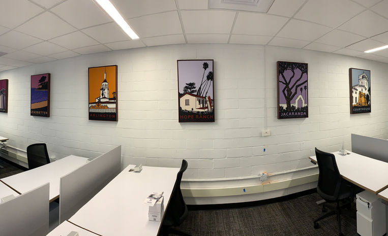
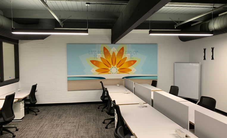
We designed Zoom’s Santa Barbara office with local coastal themes. The long, brick-walled office area was adorned with large printed acoustic panels to enhance the theme and minimize echos. Poster art by Jake Early, featuring local landmarks really gave the office a local flavor. The branding collaboration with Lush Elements gave Zoom’s brand a refreshing, organic vibe.

